%20copy.avif)

Using BPMN in Confluence to Document Business Processes
March 30, 2026
Every team has the meeting. Someone tries to explain how the renewal process works, or how a request gets routed through three departments, or what actually happens between a customer signing a contract and the first invoice going out. Voices overlap. Someone draws on a whiteboard. Half the room nods. Nobody writes it down. A week later the same questions come up in a different room with a different group of people.
Operations, finance, support, and engineering teams all run into this. The work is real, the steps are real, the handoffs are real, but the documentation tends to live as a wall of paragraphs in a Confluence page that nobody can quite picture. A list of steps reads like a recipe. A process is something else: it has decisions, parallel paths, timeouts, exceptions, and people waiting on each other. This is the gap that Business Process Model and Notation, or BPMN, was designed to fill. And inside Confluence, Capable Diagrams makes it practical to use.
Why BPMN, and why now
BPMN is a visual notation that uses a small, consistent vocabulary to describe how work flows. Tasks are rounded rectangles. Events are circles. Gateways, the diamonds that show decisions or splits, tell you when a process branches. Pools and lanes group activities by team or system, so you can see at a glance who is responsible for what. The notation has been around for two decades and the symbols have been refined to the point where a process modeler from one company can read a diagram from another and understand it without a glossary.
The notation has been around that long, but it has been hard to use in the average company. Specialised modelling tools live outside the documentation system, the diagrams get exported as static PNGs, and within a quarter the picture is out of date. So teams give up and fall back to bullet points, which they already know are insufficient. What changes when BPMN lives directly inside Confluence is that the diagram becomes part of the page that people already read. The renewal process, the onboarding checklist, the incident escalation path: they sit alongside the policy text, the linked Jira issues, and the comments from last quarter's retrospective. A diagram that lives where the work is documented is a diagram people maintain.
Drawing a real process, end to end
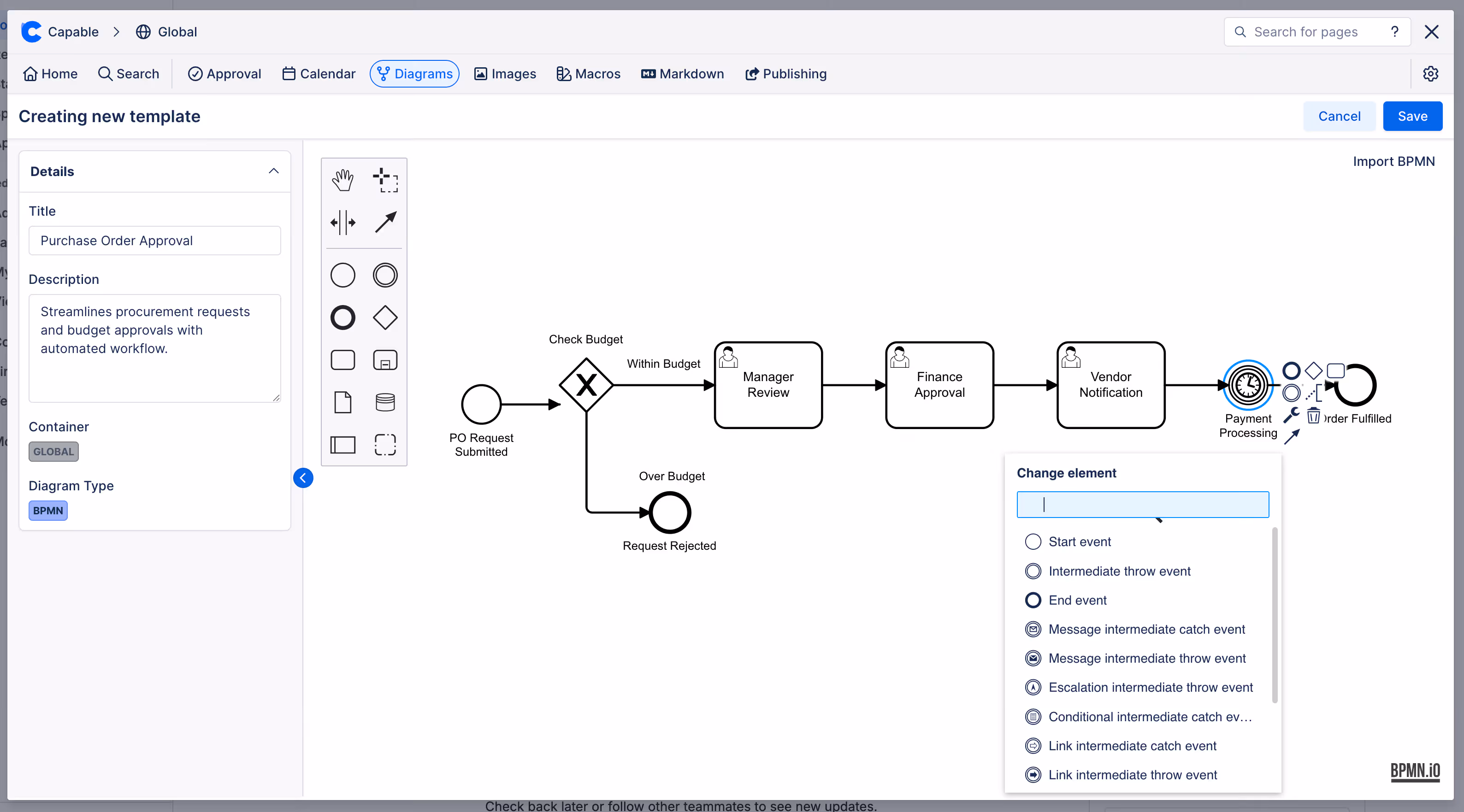
Capable Diagrams supports BPMN as one of more than twenty diagram languages, and you can choose between a visual editor for users who want to drag shapes around and a text-based editor for users who prefer to describe diagrams in code. Both produce the same result and both live inside the same Confluence macro, so a process owner can sketch the first version visually and a more technical reviewer can refine it in text without losing fidelity. The choice between the two stops being a tooling decision and becomes a matter of preference for whoever is editing in the moment.
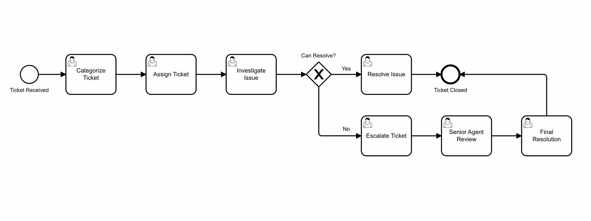
Imagine a customer onboarding process. The trigger is a signed contract. From there, the path moves through provisioning, account configuration, the first kickoff call, and a thirty-day check-in. Along the way there are decisions: is this an enterprise customer or a self-serve account? Did the kickoff get scheduled within five business days? If not, the process loops back to the customer success manager with an automated nudge. In a paragraph this is hard to follow. In BPMN it becomes legible at a glance. The pool shows that three teams are involved. The gateways show where the path can branch. The intermediate timer event makes the five-day SLA visible instead of buried in policy text. Because the diagram is embedded directly in the Confluence page, anyone who opens the page sees the current version rather than a screenshot from six months ago that someone pasted in and forgot.
Keeping the picture aligned with the work
The harder problem with process documentation is not drawing the first version. It is keeping the picture aligned with reality as the process evolves. This is where the integration with the rest of Confluence matters most. Capable Diagrams indexes every diagram across your Confluence instance, which means that when the onboarding process changes, you can find every page that references it before you publish the update. Diagrams are searchable through Capable's unified search, so a new joiner can type "onboarding" and surface the actual process flow rather than the third paragraph on the seventh page they happened to open. And because the diagrams sit inside Confluence's existing permission model, the same access controls that protect a sensitive policy page protect the diagram embedded in it.
For teams that work with version-sensitive documentation, this matters more than it sounds. A finance team documenting a quarter-close workflow does not want a frozen image. They want a living diagram that reflects the current sign-off chain, that shows when the SOX-relevant approval happens, and that they can update without leaving Confluence and without losing the audit trail. The same is true for support teams documenting escalation paths, security teams documenting incident response, and product teams documenting launch checklists. The diagram and the policy text need to evolve together or they will drift apart.
A small habit that changes how teams think
There is a quieter benefit to drawing processes this way, and it shows up in meetings rather than documentation. When a team commits to maintaining a BPMN diagram for a real process, the conversation about that process becomes more precise. People stop arguing about what the steps are and start arguing about whether the steps are right. The diagram becomes the shared object that the discussion can hang on, and once it exists, the cost of changing it is low enough that disagreements turn into edits rather than long email threads.
Engineers have known this for years from sequence diagrams and architecture diagrams. The same pattern works for operations, support, sales ops, finance, and any function that runs repeatable work. A picture is not a substitute for the written explanation. It is the thing that makes the written explanation make sense.
Where to start
Pick one process that your team explains out loud more than once a month. The renewal flow, the bug triage path, the request-to-deploy pipeline, the incident escalation chain. Draw the first version in Capable Diagrams using BPMN, embed it in the Confluence page that already documents the process, and then update it the next time something changes. The goal is not a perfect notation. The goal is a picture you can point to. If you want to see what the building blocks look like in practice, the Capable Diagrams documentation walks through the visual and text editors and shows how diagrams interact with the rest of the Confluence experience.
The whiteboard meeting will still happen. But next time, somebody will be able to open the page, point at the gateway in question, and end the conversation in five minutes.
Capable Diagrams is part of the Capable suite of apps for Confluence Cloud - helping teams plan, document, and collaborate without leaving the tools they already use.
.avif)


%20(800%20x%20200%20px).avif)