%20copy.avif)
Creating engaging Confluence pages with Rovo Remix
April 16, 2026
Somewhere in your company's Confluence right now, there is a 20-page project spec. It is comprehensive. It is meticulously structured. Its author is proud of it. And almost no one has finished reading it.
This is not a criticism of the author or your team. It's just how documentation works. The people who need the detail dig in; the people who need the gist skim; and a surprising number of people - the ones the document was actually written to influence - never open it at all.
Atlassian has some data on this. Internally, they've measured that Confluence pages with visual elements are nearly twice as likely to be read by a wider audience than pages without. That's not a small gap. That's the difference between a page that circulates and a page that sits.
The hard part, until now, has been that making those visuals is work. You draft the doc, then you open a separate tool, then you try to translate what you wrote into a chart or a flowchart or a timeline, then you paste a screenshot back in. Nobody does this consistently. Most teams stop trying after a few months.
Which is exactly what Atlassian's new feature, Remix with Rovo, is built to change.
What Remix actually does
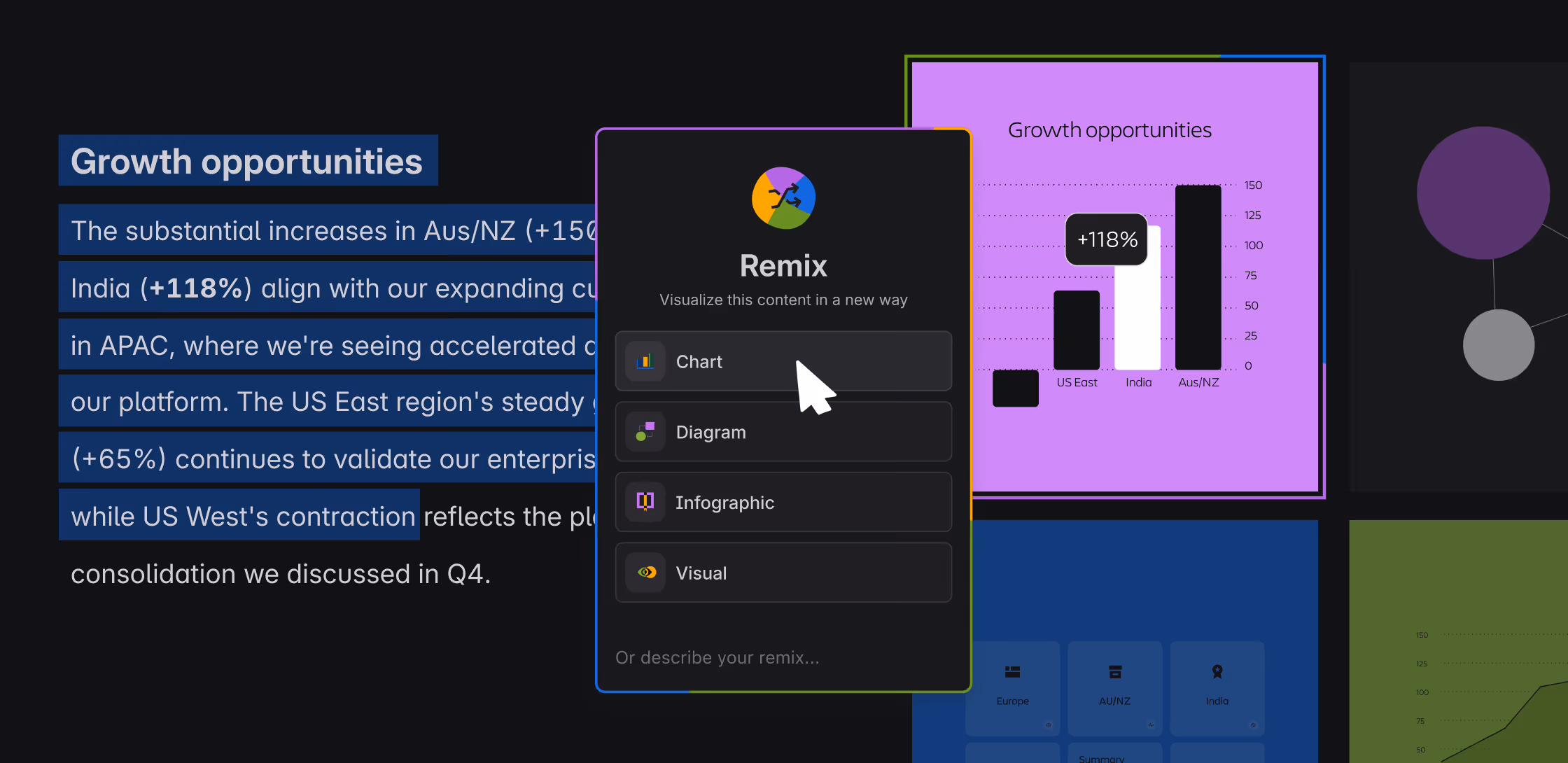
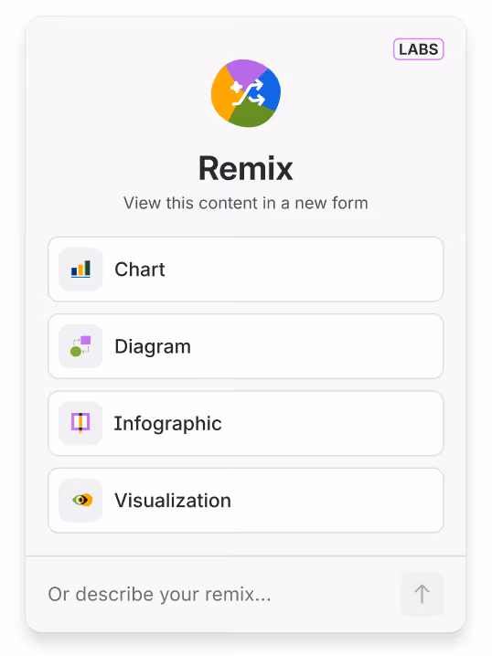
Remix is a new Confluence feature, rolled out in open beta on April 8, 2026. The short version: you highlight content on a page - a paragraph, a table, a section, a list - click "Remix," and Rovo turns it into a visual. A chart, a diagram, an infographic, a timeline. A map. A set of flip-cards. Something you can actually read at a glance.
Three things are worth noticing about how it's designed.
First, it's non-destructive. Your original content stays. The remix is layered on top - an additional view, not a replacement. Nothing you wrote gets overwritten, and nothing gets lost.
Second, it lives inside the page. You don't export to Figma, copy-paste to Canva, or open a separate whiteboard. The remixed view renders directly in Confluence, alongside the source content.
Third, it's opinionated. Rovo doesn't make you prompt-engineer your way to a good answer. You pick a format - chart, diagram, infographic, or visualization - and it produces a first draft you can tweak. You can freeform-prompt it if you want more control, but the presets do most of the heavy lifting.
The four transformations
The beta ships with four preset output categories, each tuned to a different kind of content.
Chart. If your content has numbers - a table of metrics, quarterly results, a budget breakdown - Remix will turn it into a graph. Line charts for trends, pie charts for distribution, bar charts for comparison. The kind of output most teams associate with "ugh, I have to open a spreadsheet and fight with it for twenty minutes." Except it's inline and instant.
Diagram. For anything relational: workflows, decision trees, hierarchies, dependency chains. Rovo renders it as a flowchart or mind map, embedded as a whiteboard you can keep editing. This is the transformation that will feel most useful to anyone who has ever tried to describe a six-step process in three paragraphs of prose.
Infographic. This is the "make this long section of analysis look like something a CMO would share" category. Rovo pulls out the key points and lays them out visually - modern style or sketch style, depending on your taste - with enough polish that the result genuinely looks presentation-ready.
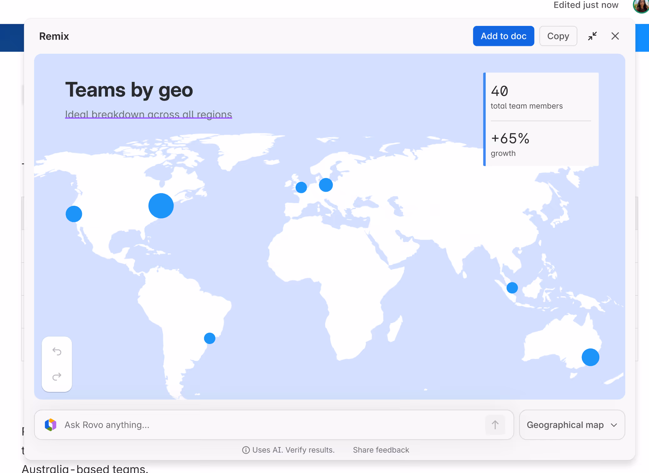
Visualization. The most interesting bucket. Visualizations are interactive: timelines that scroll, maps that cluster, org charts, flip-cards that reveal detail on hover. This is the category that most clearly suggests where Remix is headed - past static images and toward pages that behave a little like apps.
How to actually use it
There are three entry points, and it's worth knowing all of them because different content types surface different menus.
- Highlight text, use the floating toolbar. The fastest path for prose. Select a passage, and "Remix" appears alongside the usual formatting buttons.
- Use the element toolbar. When the object is structured - a table, an embed, a code block - hover it and the element toolbar offers Remix directly.
- Use the right-side block action menu. When you want to remix a larger block, or when you don't have edit permission on the page, this is the way in.
That third path is worth flagging. If you don't have edit access to a page, you can still generate a remix - you just can't save it directly to the page. You can copy it and paste it elsewhere. That's a quiet but thoughtful design choice: it means readers and reviewers can transform content to understand it, not just authors.
Once Rovo generates a preview, you can adjust the style, revise, or regenerate until it's right - then click "+Add to doc" or "+Add to page" to slot it in.
The bigger move: agents, MCP, and a composable Confluence
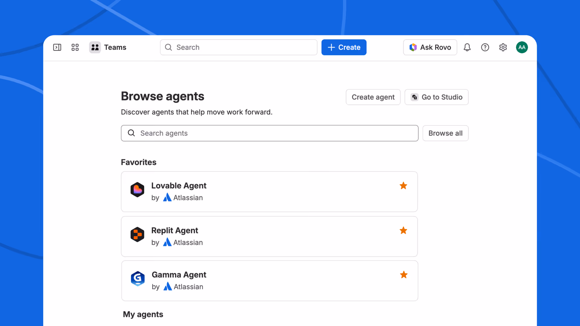
Remix didn't ship alone. Alongside it, Atlassian launched a set of out-of-the-box third-party agents from Lovable, Replit, and Gamma, all plugged into Confluence via MCP (Model Context Protocol) - the open standard that's quietly becoming the connective tissue of the AI-app ecosystem.
What those agents do is worth paying attention to, because they extend what "remix" even means:
- Lovable can take a product spec and turn it into an interactive prototype.
- Replit can turn a design doc into a starter app you can actually run.
- Gamma can turn meeting notes into a full presentation.
In other words: Remix-with-Rovo transforms content into other content. The partner agents transform content into working software. Same page, radically different outputs.
This is the frame Jonathan Katahanas, part of the Atlassian team behind Remix, pointed to when he posted about the launch on LinkedIn: "Remix with Rovo is one step of many to transform Confluence into an AI-native surface where content is fully composable."
The word to sit with there is composable. A composable Confluence is one where a page isn't a fixed artifact - it's a source that can be projected into whatever form the moment calls for. The spec can become a prototype. The proposal can become a deck. The table of data can become a chart, a timeline, or an infographic - whichever one lands best with whoever is reading.
Why this actually matters
There's a temptation, every time Atlassian ships an AI feature, to file it under "more AI stuff." Remix deserves a bit more thought than that.
What Remix changes is the relationship between effort and output for visual communication. For a long time, the cost of making a Confluence page more readable was a meaningful amount of labor: open a tool, draw a thing, export, embed, update when things change, repeat next quarter. Now the cost is one click and a preview. When cost drops like that, behavior changes - not because anyone decreed it, but because the path of least resistance just shifted.
The second-order effect is that the canonical document changes shape. If you can generate five different views of the same page - a chart for the exec, a flowchart for the engineer, a timeline for the PM, a map for the ops lead, a set of flip-cards for the new hire - the "canonical" version of the content is no longer any one particular rendering of it. It's the underlying knowledge. That's a small but real rewiring of how documentation works.
The third-order effect is the composable-surface point. Once the page can produce visuals, apps, presentations, and prototypes on demand, Confluence stops being a passive record and starts being an active workspace - the starting point, not the filing cabinet.
We’re seeing firsthand how Confluence is becoming increasingly valuable in the AI era - often surpassing Jira in usefulness for AI agents.
Unlike Jira, which is primarily structured around tracking discrete tasks and workflows, Confluence provides a more flexible, evolving knowledge base. Its content can be continuously updated, refined, and expanded over time, making it a better source of contextual understanding for AI systems.
As AI agents rely more on rich, up-to-date information to perform effectively, Confluence naturally becomes a more powerful foundation for enabling them.
A practical sketch: what to try first
If you want to feel the shift quickly, don't start with a new page. Start with an old one. Pick three candidates:
- Your team's most-skimmed page. Usually an overview doc, roadmap, or team handbook. Remix a long section into an infographic; see if the traffic and reaction change.
- A table nobody reads. A budget, a backlog, a list of OKRs. Remix into a chart. The difference in scannability is usually immediate.
- A process doc. Anything with "first, then, next, finally." Remix into a diagram. Watch the comments move from "what do you mean in step four?" to "this makes sense."
You'll see quickly which pages benefit from Remix and which ones don't need the help. The point of the exercise isn't to remix everything - it's to recalibrate your instinct for when a visual would help, now that producing one is essentially free.

Where Remix ends, and Capable picks up
We've spent this post genuinely praising Remix - because we think it's a good feature, and we're fans of Atlassian making Confluence more adaptive. But we'd be leaving something out if we didn't add one note.
Remix transforms one page at a time, inside the editor. That's one slice of what teams do with Confluence every day. The other slices - the operational plumbing - are where Capable lives, and they sit naturally alongside Remix rather than in competition with it.
A few examples of where Remix ends and we pick up:
- Approvals and governance. Remix can turn a draft into a polished infographic, but it can't route that draft through the right reviewers, track sign-offs, or gate publishing. Capable's approval workflows do. Remix speeds up creation; approvals manage consequence.
- Publishing to external audiences. A beautifully remixed page is still locked inside Confluence. Capable Publisher lets you push pages out to external or more open spaces - turning an internal knowledge base into a customer-facing one.
- Diagrams beyond AI-generated flowcharts. Rovo's diagrams are impressive for turning prose into flowcharts. For architecture diagrams, network maps, BPMN, UML, or any serious visual modeling, Capable Diagrams gives teams a proper design surface - with versioning, shared libraries, and component sets.
- Visual content at scale. Remix makes a great chart from a given table. It doesn't help you manage the thousands of images, logos, and screenshots that accumulate across a big Confluence instance. Capable's image management handles the library side of visual content.
- Calendar, scheduling, and structured content. Remix handles visuals inside a page. Capable handles when pages become relevant - release calendars, content schedules, and the publishing cycles that keep big documentation systems from drifting over time.
The shortest way to put it: Remix is about what a page can become. Capable is about what happens around, before, and after the page exists. They don't compete - they compound. Rovo makes the content more adaptive; Capable makes the workflow around that content more complete.
The shift to pay attention to
If Remix is one step of many, as Atlassian's team keeps saying, the interesting question is where the staircase leads. The answer, pretty clearly, is toward a Confluence in which "pages as static artifacts" is on the way out, and "pages as sources that can take many shapes" is on the way in.
The teams that get ahead of that shift won't be the ones with the most AI features turned on. They'll be the ones who stop thinking about documentation as something you write and start thinking about it as something you compose - with whatever tools, agents, and workflows make the content genuinely useful to the people it's meant for.
Remix is a good step in that direction. It's worth trying on a few of your team's most-overlooked pages this week.
.avif)


%20(800%20x%20200%20px).avif)